Why printed colours can look different
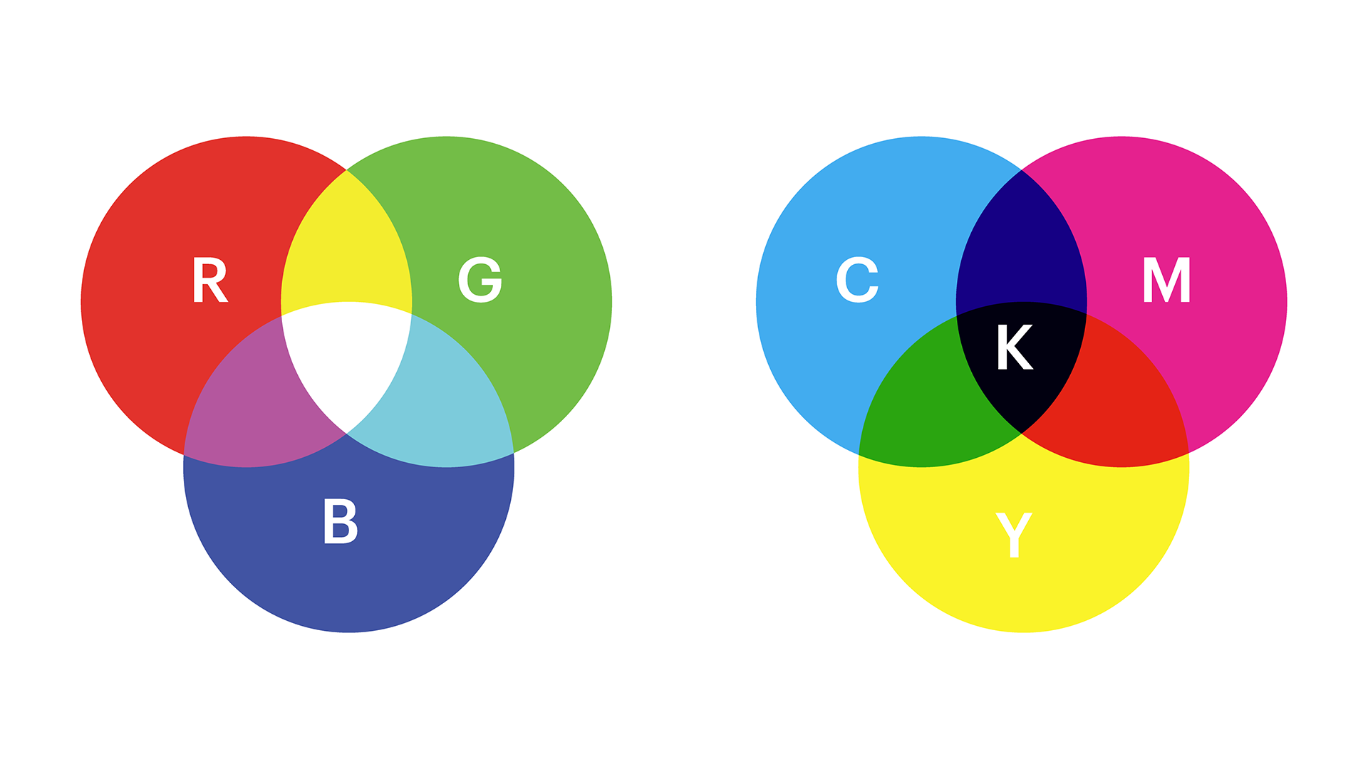
Screens emit light, so colours appear bright and vivid. Printers, on the other hand, use layers of inks to reflect light, which can make printed colours appear softer or darker.
Some colours that display perfectly on a monitor (especially neons, very bright blues and greens) don't have exact matches in CMYK inks. During printing, we adjust these colours to the nearest possible shade.
To make sure your design looks its best, our production process automatically balances colour and contrast before printing.
Tips for keeping your colours consistent from design to print
These tips will help your final product look as close as possible to what your screen displays:
Design in CMYK mode if possible. It's closer to how colours appear in print.
Avoid overly bright or fluorescent colours that may not print well.
Use high-resolution files (300 DPI or higher) to ensure sharp, crisp details that allow your colours to appear more vibrant and solid.
How we make sure your colours look their best
We know how disappointing it can be when your printed product doesn't look like you expected. Our team uses professional colour calibration and automated correction to ensure each product looks balanced, vibrant and true to your design.